VMware Explore 22 Theme Animations
In 2022 VMware changed the name of its flagship event from VMworld to Explore. This also called for a radially different branding approach. Once again, I was charged with creating all of the animated branding elements for the event. Additionally, the needs were expanded to include libraries and kits for China, Japan, and Singapore. Additional elements for Brazil and India. And additional branding elements and templates not created in previous years such as text blocks and stingers. It was a challenge to create all the assets and kits and support all of the vendors across the globe. But I was able to exceed expectations and create and manage all of these assets and more.
Templates and Toolkits
-

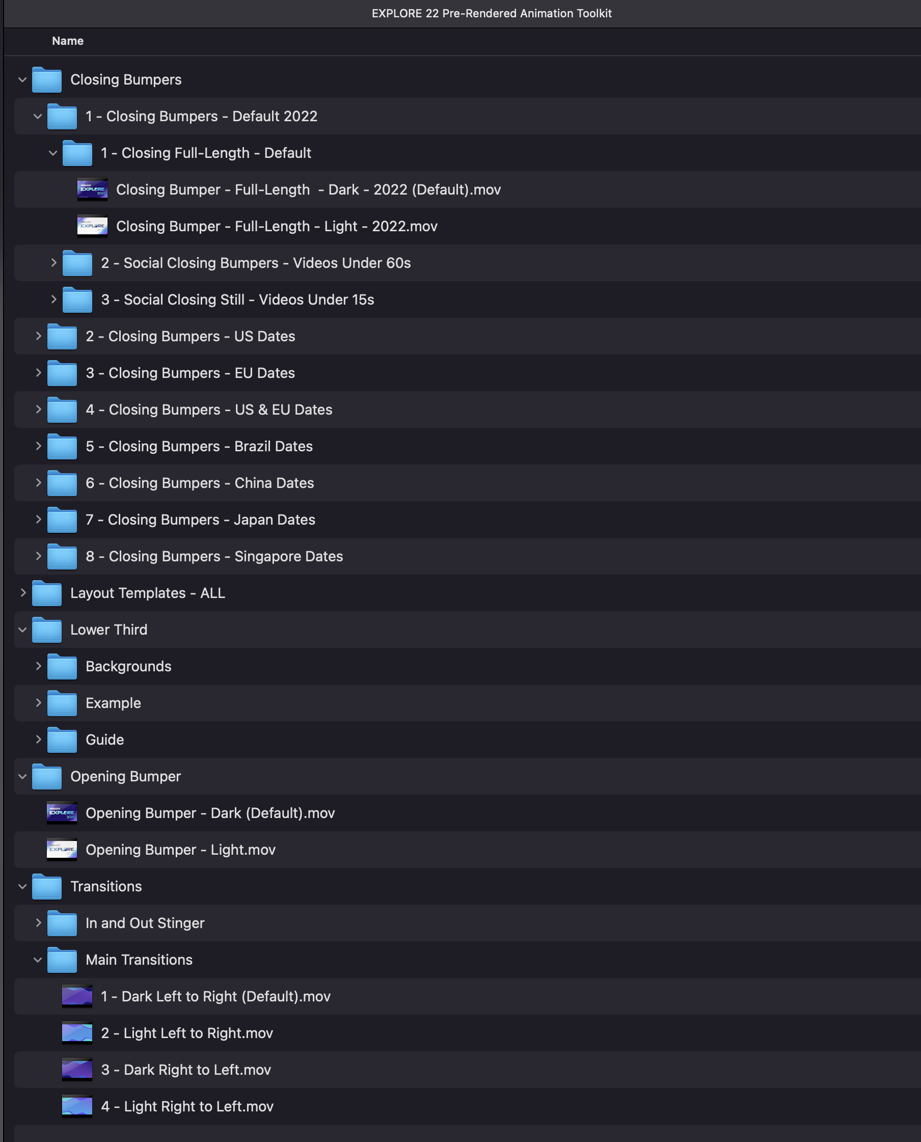
Pre-Rendered Animation Templates Kit
The pre-rendered animation toolkit is for content creators without the access or ability to utilize the motion graphics templates distributed through the Adobe CC library. This kit includes pre-rendered versions of all variations and specific instructions for re-creating the animations. This is useful for internal creators and non-adobe users and becomes a key distributed asset of enablement.
-

Adobe CC Animation Template Library
The Adobe CC template library is the main tool to share the animation templates with agencies, vendors, and content creators. It consisted of 15 templates, all created in After Effects for use by editors in Premiere Pro. It also included two companion libraries for China and Japan that had template variations for their native languages.
-

Video Toolkit
The video toolkit consists of project files for many of the Explore 22 animations. This allows animators and content creators from external agencies and vendors to create assets based on the animations I have already created in alignment with the theme and stakeholders’ approvals. This is a powerful tool for the enablement of on-site productions as well.
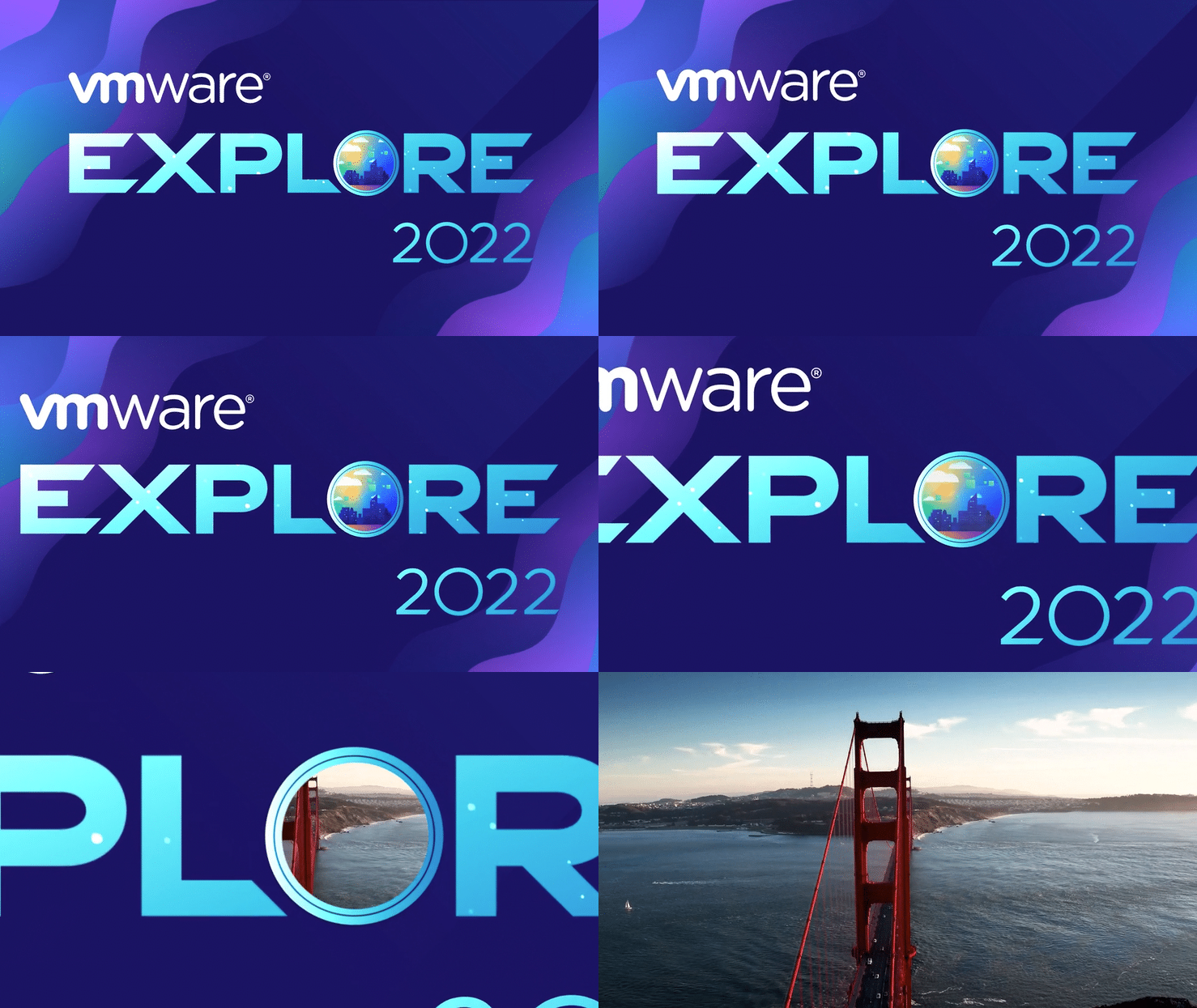
Dark (default) Opening Bumper Over Footage
Dark (default) Full-Length Closing Bumper Over Footage
Light Variation of Full-Length Closing Bumper
Bumpers
It usually begins with the bumpers. For Explore 22, the bumpers were created and distributed through almost twenty variations. These included regional-specific and global variations, ad, vertical, shortened, and still image versions. Each variation also had a default dark version, as well as an alternate light-colored version.
Mobile App Login Animation
For the Explore 22 Mobile App, they wanted to include a nice simple animation that loaded the first time the user opened the app. This was a last-minute request but I was able to deliver two variations.
Lower Thirds
Lower thirds are a key element of the event animation templates. They are also quite a tricky one. The lower third template is set up so that it auto-adjusts to the name, title, and company of the person and includes some additional options such as a third line (for really long names or titles) and a left/right option.
Transitions
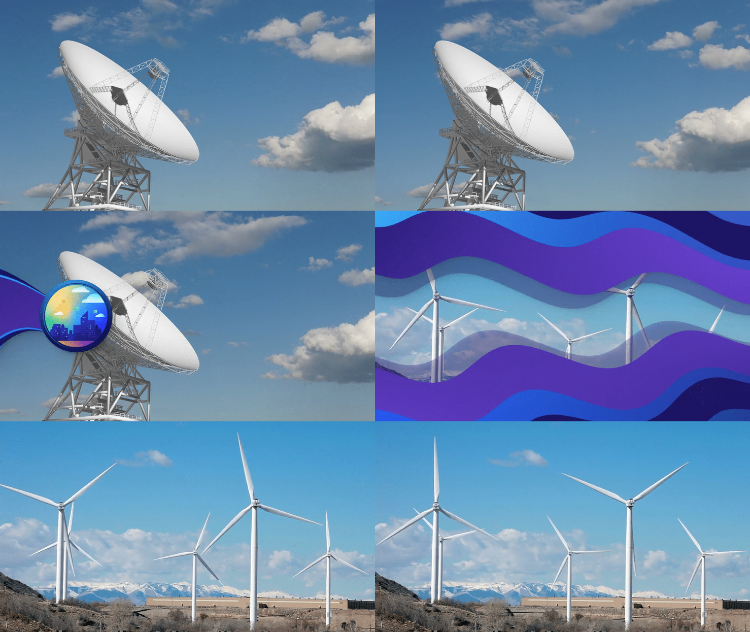
For Explore 2022, I also created a branded transition template. This transition was simple but maintained the integrity of the theme. It has a few simple variations, including an alternate color scheme and a left-to-right version. It was used extensively throughout the videos produced for the event.
Stinger
This year, in addition to the normal transition, I created what we called the “In and Out Stinger”. This was used as a more punctuated transition.
Additional Explore 22 Creative Assets
Music Curation
For Explore 22, I also curated a music library of pre-approved licensed music available to use for all Explore 22 video productions.
Layouts & Backgrounds
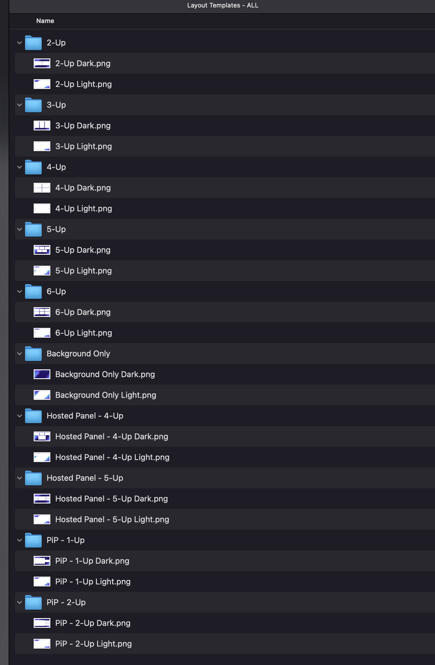
For all pre-recorded Explore sessions, as well as many of the other productions, a library of layouts and backgrounds that aligned with the theme were created. This library contained dozens of options and configurations and was used extensively by external agencies and vendors.


